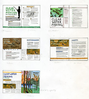
 These are my five thumbnails for the Clear Water Fishing article. This is an informational article with tips on how to fish during the dry summers when the water of lakes and rivers is very clear, which makes it more difficult to fish.
 I have had enough experience fishing to know what the article was talking about, but I am definitely not a fan. I thought the idea behind this project was really different and interesting to think about. The purpose though is to really focus on who your audience is.
I don't really feel like I came up with a concept; I focused more on the layout. But I do feel like I kept my audience in mind by keeping each of the layouts fairly simple. I don't think my audience would have appreciated or responded very well to something very elaborate and detailed. I tried to incorporate large photos into every layout and stick to greens, yellows, browns and blues.
The layout that I like the best after talking to Albert is the top right. I think this is the best solution because of the large photo and large headline will draw the reader in better than any of the others. I also feel like both pages of this layout are more united than any of the others because of the bar across the top that connects the two. I decided to break up the body of text using bullets because the copy is pretty well divided into six different "tips". The colors used are green, brown and black.
In addition, I might actually use the layout from the bottom right thumbnail for the large body of type - two columns instead of just one large column.

No comments:
Post a Comment