Monday, April 27, 2009

Best Color Thumbnails


These are my best example of full color thumbnails. I had several good creative concepts to chose from, but the color scheme pretty much remained the same. I would have been happy doing any of these layouts, but the one that Albert chose, the one with the polaroid, was my favorite and actually my very first idea when brainstorming. 
Another layout that I would have really liked to have seen in the final production stage would have been the one with the large red A in the background or even the restoration one where the car is divided by a grid. This was one of the first times where I really like several of my layouts a lot. Usually I tend to favor one, and the others are just to fill space. What I'm trying to say is that one of the things I think I have improved on a lot this semester is brainstorming... Allowing myself to run through a lot of ideas, good and bad because even bad ideas can help lead you to a good one.

Best Marker Comp

I chose the My Favorite Ride Promotion project as my best example of a full color marker comp. I think all my marker comps were pretty good, but I chose this one because it includes all the text (no copy fitting) and it was full color, unlike the Chili Cook-Off poster or the Writing Center Poster which were both black and white.
The typefaces that I used are apparent but could still be a little tighter; hopefully that will come with more practice.
The car is also accurately drawn. It is just really clear what everything is and where it will be placed in the final production which good for the client.


Best example of Traditional Copyfitting


We did two projects this semester where we were required to copy-fit all the given text so that we knew how much space it would take up in the final layout. This process definitely took some time to get used to, but once I got the hang of it, I understood how it can be very helpful. My biggest problem was deciding how big I wanted the columns to be, what font size, orientation, etc. etc... And all of this needed to be decided before I could even start! I couldn't help but wonder how it would look on screen. But I think that will get easier with more practice because I'll be more familiar with text on screen and how to adjust it and so on.
But in both projects, I was fairly accurate. I did have to change the first column on the right page so that the top of "Techniques" lined up with the two columns on either side. After printing, I realized the the copy really wasn't as readable as it could have been so I increased the leading to 12 pt (like it should have been in the first place), justified the columns and decreased the kerning to avoid any orphans. No, I think the text is more readable. I also added the numbers behind the text to emphasize the way that I broke up the copy. I combined most of the copy that we were given so that it was divided into six different ideas or techniques and I think the numbers help communicate this as well as add a little more interest to this side of the layout.


Best example of Typography Use and Best Creative Concept

I really enjoyed doing the Chili Cook-off Poster. I had a lot of ideas at the thumbnail stage, and even though my favorite idea wasn't chosen to go onto the next stage, I was able to make this idea my favorite. I like the final product a lot more than I thought I was going to. I feel like my concept was very unique and different than what everyone else was doing and that's why i chose this as my best example of a creative concept. It is definitely a little weird (how often do you see a tree growing out of a bowl of chili?) but I thought because it was so weird, people would be more likely to stop and see what was going on and be interested enough to read what the poster was about so that they could make since of this picture. I wanted to use the tree to communicate the location (on the quad) as well as the purpose of the event (to promote National Ag Week 09). 
I also liked this project because I had to draw the graphic by hand so I was able to learn a new process (not that I prefer this over vector art or photos!) 
I chose this project as my best example of typography use as well. To begin with, everything is legible and I feel like the title not only reads as "Chili", but it looks and says "Chili"... does that make sense? The title, and "Nat. Ag Week" are the largest to help explain the graphic quickly and then the other information is in between the two wrapping around the bowl of chili. I know I still have a lot to learn about typesetting and typography but I have really enjoyed working with text this semester even though there are a lot of nit-picky things to keep in mind. I feel like for the most part, I have handled most of these issues well.

Proficiency in InDesign and Example of Best Design

This has been one of my favorite projects this semester, but it didn't start out that way. I had a really hard time at the thumbnail stage for this project. I think mostly because I had four pages to think about.  But it also could have been just a bad week for me... who knows. In the end I feel like I was able to pull off a successful layout. 
I am using this project to show proficiency in InDesign for the semester. Everything is technically correct  - all photos and graphics are .eps from photoshop or illustrator and have links. Resolution is set at 300ppi and color mode is CMYK for printing.  This is also my example of best design as far as structure, hierarchy, and the use of design elements and principles. I used a three column grid throughout the layout and kept a consistent color palette. the silhouette of Mickey's head on the cover compliments the six classic Disney character silhouettes found on the interior next to all the information that is Disney related in Marceline. The back outside cover, then, contains all the non-Disney related information. I enjoyed dividing up the text and organizing it the way I wanted to and I actually found copyfitting really helpful. It made the production step go so quickly and smoothly. 
I did have a problem printing this time around. I didn't center the layout in the middle of the page before converting it to a .pdf, so about 1/4 of an inch on the left side of the layout didn't print. So I reprinted and everything is fine! And the only thing that I have chosen to redo on this project was the cover. I never really liked it that much to begin with, but wasn't sure what else to do with it. It just wasn't cohesive; every element was seperate from the others. So I mad the title larger - much larger so that it overlapped Mickey's ear and even overlapped each other. Because of this, I included a blue stroke to the text to make it stand out from the ear and the other overlapping text and I think a sense of depth was created making it more interesting overall. I also added a blue horizontal band across the top to set off the headline "Marceline" and hightlight "Walt Disney's Hometown". By changing these two things, I think the cover is more unified and cohesive. I just wish I would have thought of it sooner.

Proficiency in Photoshop

Out of the three programs that we used this semester, Photoshop is definitely the one that I had the hardest time with and what little I did learn I'm not sure if I remember... I think this program has a lot more technical things that you have to be aware of than Illustrator or InDesign. So it just takes more time to adjust to and become comfortable with. But Photoshop is definitely something I want to become very familiar with because I would still love to somehow incorporate photography into my work/job or maybe even become a photographer.
This is my best piece in Photoshop - our Mood project where we had to combine 3-5 photos to create a mood. These are all photos that I have taken in the past, all at different times within the last three years. As I have blogged before, the mood I was trying to create was a calming, relaxing mood because I find those things in nature. 
I used masks to cut out my roommate's head and the leaves from their original pictures and altered the color/saturation of each of them. I also cranked up the saturation of the background photo as well. Then, once they were all on the same page, arranged the way I wanted them, I created four separate gradient masks (one for Erin and each of the leaves). Now, each part of each object slowly starts to become slightly translucent to add to the airy feel. Finally, I used the paintbrush tool to add the smaller leaves that seem to blow away in the distance. The paintbrush tool allowed my to make this selection and make it lighter than the rest of the background.
I hope that I am able to learn more about photoshop and become more comfortable with it in the future.

Proficiency in Illustrator

I don't know how I could chose anything other than my vector drawing of the 1928 Ford Model A to demonstrate my proficiency in Illustrator. This was the most time consuming project this semester and it was definitely worth it. Since this project, I have been very comfortable with the pen tool. I did attempt to use the gradient mesh tool, but I was already more than half-way finished and it didn't look very good with the work that I had already done. And I don't think it looked any better than the way I was originally doing it just with layers and the blur effect. 
There are so many little details about this car; I was concerned that I wouldn't be able to make it look like a photograph... but i did! 


Wednesday, April 22, 2009

2 Page Fishing Magazine Spread

This is the final art production of my magazine layout for the fishing article. This one, as opposed to the Marceline pamphlet changed a little bit more from the original marker comp, but the overall layout is the same. 
The photo I wanted to use couldn't be used as large as I wanted to. Originally it was going to bleed off the page, and the title was going to be smaller. So all I have done, is basically switch the two. Now, the title is large and in charge and the photo is smaller. I also brought the "techniques" column up to line up with the two columns on either side of it. Finally, I added a by line after the introductory text because I didn't like all that empty space and I wanted to incorporate the green color from the top of the layout. And yes, it is a fake by line... I don't know who Tom Jones is...?
After the class critique, I was surprised to see how many people used a photograph for their background. A lot of them looked really good though. I would have been too scared to do that. But I was wondering if they found those photos that large or if they had to make them that large and if so, how did they maintain the resolution? Or did they all turn them into graphics on photoshop? This is definitely something I would like to look into for future designs. The only thing I didn't like about the large photo backgrounds were the ones with the white columns to improve readability. They just made the layout look so choppy. 


Marceline Pamphlet


This is the final art production of my Marceline pamphlet. The only thing I have to worry about now is the printing process... and then combining the two pages to form a booklet. I've got my fingers crossed! 
After finishing this project, I see the value and importance of the copy fitting process. All I had to do once I got to the computer stage was plug in all the type. 
I didn't have any trouble with the silhouettes, but the photo of Walt on the front took some time. First getting it to the right size and resolution, but then getting it to fit the Mickey Mouse shape. The picture was not tall enough to fill the whole shape so I had to fill the ear in with black but then you could see the top edge of the photo. I went back into photoshop and added a black gradient to the top of the photo so that it would blend into the the black of the ear. This worked out much better than I thought it was going to. Then, to make the photo match the Mickey Mouse shape I had to make a white background to act as sort of a mask to hide the part of the photo I didn't want to see.
The only thing that I changed from the marker comp is the title "Marceline" is now in front of the Mickey Mouse shape instead of behind it.

Monday, April 20, 2009

Fishing Layout

This is my two page magazine spread for the clear water fishing article. This project has been much easier than it would have been if we had not have done the Marceline project first. The copy fitting went much quicker. 
I found a lot of cool pictures, but I decided to just use one and make it large and the focus of the layout. As I said before at the thumbnail process, I wanted to keep this layout simple, not flashy or complicated. I think using the one photo and pulling colors from that photo helped me do this. 
Even though the copy fitting was easier this time around, it still didn't fit exactly the way I had envisioned it fitting before hand. I didn't think the copy would take up quite as much room as it did on the right page. Because of this, I'm going to have to fix some of the alignments. I originally wanted "Techniques" to line up with the bottom of the photo, but it had to be pushed up to allow the text more room. So what I might end up doing is just moving it all the way to the top to align with the other two text boxes. I will also move all the text on the right page to left align with the left margin and have a small open column on the outside right instead of trapping that negative space in between the two pages like it is now. 


Friday, April 17, 2009

Presentation and Final Art Production

I liked giving the presentations today of our Marceline marker comps. One, because it will helped me get used to talking in front of other people about my work (goodness knows I need it) and two, it's a good way to see what other people in the class are doing and how they go about solving the same problems that I have. 
I have already started the final art production stage for the pamphlet and it is going really well so far. I have two more silhouettes to draw and I have to figure out how to do the photo of Walt in the shape of Mickey's head - not quite sure how that will work out. But I have plenty of time because all the copy went into place as planned.
For the most part I have really enjoyed this process! Hopefully the printing process will go as well as it has in the past as well. 

Wednesday, April 15, 2009

Marceline Marker Comp


This is my full sized marker comp for the Marceline pamphlet.  
Over all, I think it turned out pretty well although it took much longer than I expected. Mainly because of the copy fitting. This was definitely not the original way that I had all the copy laid out. After I copy fit everything, I cut out each paragraph so that I could move them around and look at different layouts. It took a lot of rearranging to get the copy to fit. I hope that when I get to the final art production stage I will be able to adjust and tweak the copy even more because I still don't think it's as good as it could be because while working on the marker comp, my main concern was time. 
As far as my design goes, the cover consists of a photograph of Walt Disney cut out in the shape of Mickey's head which is continued on the back in a light blue so that type could be placed over it. The inside has left and right panels to seperate this information from the information in the center and the bottom panel has six disney character silhouette's. I chose to do silhouettes instead of the full figure to keep it simple and to help keep the focus on Marceline and Walt Disney. I think if the actual characters were used in full color, they would be distracting and I would automatically think of Disney World - which is not the focus of the pamphlet. 
As far all the colors, I tried to stick to blue green and red to complement the photograph on the front.

Friday, April 10, 2009

Two Page Magazine Thumbnails

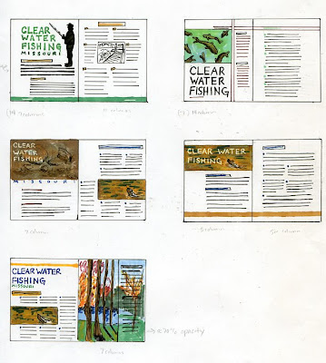
These are my five thumbnails for the Clear Water Fishing article. This is an informational article with tips on how to fish during the dry summers when the water of lakes and rivers is very clear, which makes it more difficult to fish.
I have had enough experience fishing to know what the article was talking about, but I am definitely not a fan. I thought the idea behind this project was really different and interesting to think about. The purpose though is to really focus on who your audience is.
I don't really feel like I came up with a concept; I focused more on the layout. But I do feel like I kept my audience in mind by keeping each of the layouts fairly simple. I don't think my audience would have appreciated or responded very well to something very elaborate and detailed. I tried to incorporate large photos into every layout and stick to greens, yellows, browns and blues.
The layout that I like the best after talking to Albert is the top right. I think this is the best solution because of the large photo and large headline will draw the reader in better than any of the others. I also feel like both pages of this layout are more united than any of the others because of the bar across the top that connects the two. I decided to break up the body of text using bullets because the copy is pretty well divided into six different "tips". The colors used are green, brown and black.
In addition, I might actually use the layout from the bottom right thumbnail for the large body of type - two columns instead of just one large column.

Wednesday, April 8, 2009

Marceline Thumbnails


These are the five thumbnails for the pamplet to promote Marceline, Missouri - Walt Disney's hometown. This time, the brainstorming/thumbnail process was much more difficult for me than any of the other projects we have done. Why? I don't know. I think maybe it was because I had four sides to worry about and not knowing how much space the type was going to take up was hard for me to wrap my head around. And I didn't want to take the time to copy fit it to this small scale thumbnail. I wanted to be to the full size marker comp stage so badly.
For the most part though, I like the ideas that I was able to come up with. Although most of them would need some tweaking before going on to the next stage. After talking with Albert, I decided that the two top layouts would be my best option. I definitely want to use the inside layout that uses the character's silhouettes, but maybe try and squeeze in a picture or two and maybe even the color green to go better with the outside design that I think I'm going to do.
As for the outside, I think I might go with the top one on the left with the large mickey mouse head. I feel like the idea is more original than the one below it because the one below it is just a large picture of Walt with large type - which could look really good, but not as unique.

Monday, April 6, 2009

Promotion Poster

This is the final production of the My Favorite Ride Promotion Poster. 
The only comment I have is that on the printed version the car and the red stripe are much darker than I thought/wanted them to be. So now, the overall layout is rather dark.

Friday, April 3, 2009

This is the final marker comp of my favorite ride promotion poster. This comp came out the way I expected it would from my original thumbnail. I didn't really use a grid, I just had this diagonal layout in my mind split in half by the polaroid and the text. 
I will have to print on a piece of paper larger than 13x19 to accommodate the bleed as well as create the polaroid graphic in either illustrator or photoshop. Probably illustrator because I am more familiar with it. The only thing I would like to improve is the shadow cast by the polaroid, it is much too light.