The most important thing that I think I learned from Illustration this semester was PROCESS. Idea - thumbnails - pencil comp - marker comp - illustration - computer. And the more work that you put into it in the earlier stages, the easier it will be later on so that you can focus more on technique and presentation.
I will admit that at the beginning of this class I was definitely the kind of person who tried to get to the actual illustration step as quickly as possible. I thought all my problems would be better solved at this point. But once I slowed myself down a bit, I realized how much time and effort I was saving myself by paying more attention to the little details in the first couple of stages of a project.
Here are eight of my projects from this semester that I feel show the widest range of skills and techniques that I have learned this year.
The first one is a 6x4.5 water color from the very beginning of the semester, but this is one of the later ones that I did with a landscape and an architectural structure. I actually did all the line work first, then went back and added the color. I like this a lot better than painting on a plain piece of paper or with just a pencil drawing. This is my best little water color because I feel like it was the first time that I let the paint do it's job. Before this point, I was fiddling with the paint and overworking it. I also really like the colors in this piece.
The second piece is a product illustration of a soda can done in gouache. The goal was to make it look "sexy". The best way to do this would be to make it look as realistic as possible like you could go up and grab it off the shelf. I feel like I was successful in making it look real and added an extra punch of sexiness by adding the reflection. I think this project showed my confidence with the material because it took a lot of patience and precision to 'pick-out' the lettering. I painted the whole can red first then went in and picked out all the red paint in the lettering and then went back over the lettering with three coats of white because the red paint stained the board pink. I really enjoyed this project.
The third piece is actually a marker comp for the Three Image Montage project. I included this to show my marker skills as well as how I apply color at this stage and transfer it to the next stage. This project is what made me realize how helpful a well done marker comp can be when you go to paint the actual project.
The fourth piece is the Three Image Montage done in gouache. Since we did this project twice, this is my second attempt. The only part that I really feel is a lot stronger in this one than in the first one is the key. It was much darker in the first one and the highlights were very weak. It also didn't have enough contrast from the kiwi skin behind it. I feel like this project shows how I am able to put together a composition even when each element is very unrelated. I used realistic colors for the most part except I made the giraffe slightly more orange and I decided to make the key have a deep blue tint to it even though the original key was dark brown.
The fifth piece is the Missouri postcard which illustrates what Missouri means to me. I chose to duplicate a picture that I took of myself riding my bike on the Katy Trail. I love riding my bike and in my hometown, Jefferson City, you can ride right along the Missouri river which is very cool. I chose to switch up the colors though because while the photo had a nice view point, the colors weren't anything exciting to talk about. So I decided to make the ground and my shadow a cool blue and my body and the bike warm colors, red, orange and yellow. I used water color for this project because I had been using a LOT of gouache lately.
The sixth piece was my Cheesy airbrush. Overall, I enjoyed airbrush a lot more than I thought I would, but MAN! it really sucks when you are trying to work with an airbrush that is not wanting to cooperate...anyways this was a fun project. I airbrushed a turtle giving the thumbs up and looks like he's from the sixties. It's a Lisa Frank design and I grew up with so much Lisa Frank stuff it's ridiculous. And nothing is quite as cheesy as this. As far as technique, I strangely feel a lot more comfortable doing things free hand than with the frisket and I like the outcome better too. I was only able to use freehand for the purple part of the shell and the green part of his head and hand. These are the areas that I feel look the best. Some of the other areas got a little messy from taking off and replacing the frisket after each color.
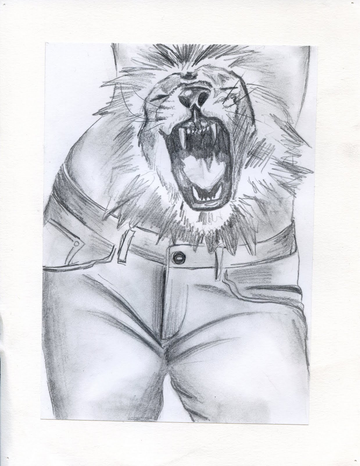
The seventh piece was the sound illustration. I chose to illustrate the sound of a growling stomach because my stomach is always talking...sometimes it's embarrassing, especially when it roars! Anyways, I think this project is my best example of a good, developed concept because it doesn't take the sound literally. Obviously there aren't really lions in our stomachs, but sometimes it feels that way. There was a bit of a debate over whether the lion was growling or roaring and it was suggested that I use a lion who was simply snarling. I tried this but didn't like it because I feel like the whole concept was lost. The lion just ended up looking angry. The like the lion that I chose because the focus is on the mouth and even if it does seem like it's roaring i think it works because the sound is just exaggerated that much more.
The eighth and final piece is my book illustration for To Kill a Mockingbird by Harper Lee. My original plan was much different than this and I ended up doing another set of thumbnails which was very helpful. I feel like my original ideas were either not original enough or simply too cliche. This composition works well because of the unique perspective. I chose to use watercolor because I think it has a softer look than gouache does and I wanted to reflect the softer side of this book rather than the darker side that includes all the judgment and prejudice that goes on in the book.

Tuesday, December 15, 2009


Book Illustration
 Here is the finished book illustration for the book To Kill a Mockingbird by Harper Lee. I used watercolor and black pen. I am really happy with the way this turned out especially with the perspective. The picket fence looks a lot better than it did in my marker comp and the cracks in the sidewalk add interest. See it with type in my final portfolio!
Friday, December 4, 2009

This is my final growling stomach illustration. I'm really happy with the way this turned out, especially the lion. And I'm surprised how little trouble I had with it. But I think the reason is because I just PAINTED! Forget the pick out method...I think that's what was giving me such a hard time before. I didn't put any gesso/matte medium down so that I would prevent myself from picking out the color because otherwise I would ruin the board...seemed to work pretty well.
Book Cover Marker Comp

This is my marker comp for the To Kill A Mockingbird book cover. As far as the colors go I was trying to keep them rather muted.
I got a lot of positive feed back. The only bad comment was that the trees need work, and I agree. I also nee to work on the fence. I scared of the tiny panels of the picket fence so I made it more of a wooden panel fence but really it looks like a concrete wall...so that will need to be fixed. I'm going to add some cracks in the concrete sidewalk as well.
More Book Thumbnails

 Ok, I had a new idea... I still want to use the idea of the ball of string unraveling into the shape of the mockingbird. But there was a tree on the original cover so I want to change the background to a sidewalk leading up to a house. I think it will be more interesting with a more unique point of view.
Monday, November 30, 2009
Book Cover Thumbnails

 These are my quick ideas for the book cover project. I chose to do To Kill a Mockingbird. Several of my ideas have to do with the contrasting views and the prejudices that come up in the book, primarily those issues between the black and white communities. That's why I chose to do the ying-yang ideas with the man's silhouette and the bird shadow because several of the characters throughout the book are supposed to represent innocent mockingbirds.
Two of the other sketches illustrate the gifts that Boo Radely leaves behind in the knot hole in the tree for the kids. And the last one is sort of silly...a mockingbird being squashed by a judge's gavel. This is supposed to be symbolic, not literal of course. In the book when the court rules Tom Robinson guilty, it was like the judge taking his gavel and killing the mockingbird...does that make sense...?
Anyways I think I'm going to work on the one with the tree and the knot hole with the ball of twine draping down into the shape of a bird. I need to wiggle the compostion around a little to create a better focal point and really think about where the title will go. I might add a few more the the little "gifts' that Boo leaves behind to the knot hole. I also want the bird shape to look looser, maybe by adding small nails to the tree and make it look like the strig is draped over the nails in the shape of the bird.
After I figure all that out, I'll move onto color. Right now I'm picturing sort of a whimsical color scheme I guess you would say. I think I want the background to be pretty dark like a dark navy and then the tree to be brown obviously, and then have the twine be a purpleish white and I also want there to be some gree so I migh add some leaves some how...
Friday, November 20, 2009
SOUND ILLUSTRATION


Here is my pencil comp and two marker comps of the sound illustration. I chose to illustrate the sound of stomach growling because my stomach is constantly making noises. And sometimes, it even "roars" at me. I was really happy with the pencil comp and immediatley went onto the markercomp stage. Then, after getting feedback from peers in class, we had to do a second marker comp and change something that someone suggested. I got a lot of positive feedback but there was one person who said that the illustration read as stomach "roaring" instead of stomach "growling". They suggested having the lion look more like he was snarling instead of roaring. But the reason I chose that lion was because the focus was on the mouth, not the eyes or any other part of the lion. Also to exaggerate what was happening, exaggerate the sound. I was pretty sure if I had a lion snarling, it would just look like an angry lion on someone's stomach and that's what I think my second marker comp looks like. The focus is on the eyes and not the mouth. Another issue that I had to deal with was making sure the lion didn't look like a tatoo. But I feel like I was successful in making it look like a lion head as part of the girl's body by extending the mane past the edge of the body as well as blending in parts of the mane with the texture of the skin.
Now, I've got to paint this. And I'm hoping I didn't bite off more than I can chew...just because I can draw it well doesn't mean I will be able to paint it well. And I'm pretty sure I'm going to use gouache but I'm going to try and just paint - no pick-out method, in other worlds. We shall see...
Final Guinness World Record Poster
Oh finally. This is my final Guinness Book Of World Records Poster with text included. I am happy with the final version of the painting, especially considering what it looked like at first. Everything sort of just blended together. I added more contrast and so line work to give the piece more structure. The silly shirt was redone six times and the fifth time might have been succesful but I ran out of green gouache. I also had a lot of trouble with this painting because I think I have associated the pick-out method as the only technique you can use with gouache. But that's obviously not true. So once I had color "blocked in" I to force myself to just simply add paint to what was already there and avoid thinking about picking any of it or subtracting any of the exisiting paint. Once I did that things started to look better. 

Final MO Postcard
This is my final Missouri postcard. I chose to use watercolor for this project because I missed using watercolor...and I was tired of gouache...I think it looks almost identical to my marker comp. After doing it, I'm not sure that watercolor was the best medium because I feel like there was a lot of little detail and I felt like I had to be fairly controlling with the paint. I'm not sure that any of the watercolor techniques from the beginning of the semester were reflected in this project but I'm not sure how I would do it differently I guess.

Final Cheesy Airbrush
Here's my cheesy cheesy turtle done in airbrush! Cutting out all the shapes from the frisket was relatively easy (especially with a sharp blade). First, I did the purple part of the shell. I used a piece of paper as a mask to make the hard edge near the top - so far so good, I was feelin confident. Then I started on the flowers, not too bad. There was a lot of taking the frisket off and then putting it back on to do each color. Then the lab was really close to closing so I had to stop and clean up. I was hoping to get the whole thing done in one go (about six hours) but that didn't happen. So I came back the next day to finish it and the lab was crowded like I knew it would be and my new airbrush and I were not getting along. But the green part turned out pretty nicely. I especially like the highlight on the nose where you can still see some of the paper through the paint. I did all the green freehand. Then for the circles, I used the plastic stencils that were in the drawer because I didn't cut out the circles from the frisket very well...they weren't very circular. This time around I had a lot more trouble with the paint being too wet. I know I was also rushing a bit too. That's all I have to say about that. It's CHEESY :)

Friday, November 13, 2009
Cheesy Airbrush marker comp
This is the marker comp for the cheesy airbrush project! Isn't he cute!? Thumbs up! This should be fun.

Wednesday, November 11, 2009
Missouri Postcard Marker Comp
This is my marker comp for the Missouri Postcard. This is from a picture of me riding my bicycle last summer on the Katy Trail (that's how it relates to Missouri) I just thought it was a really cool picture and Rusty picked the thumbnail of this immediately so... But obviously I didn't use the photographic colors. I messed around with several different color combinations, all I knew is that I wanted it to be bright. So I decided to have my body and the bike be all warm colors and the ground and shadow to be cool colors, primarily blue because I didn't want to have the entire rainbow on the postcard. 

Second Fruit Airbrush
Much better. And it took me about half as much time as the cherry did! I free-handed all the highlights which I think looks much better. But I wish I would have let a little more of the paper show through in some areas. I also tried added some colored pencil on this one to add some detail work like the lines in the leaves and texture on the twig but I didn't like the way it was looking so I erased it the best I could... and there are NO WHITE LINES from lining up the frisket incorretly :)

Wednesday, November 4, 2009
Airbrushed Fruit
My first attempt at airbrush, well besides the practice exercises with the spheres, cubes, cones etc... Not too bad, but could use some improvement of course. I had a very difficult time cutting out the friskit (now, after doing the second fruit, I know it's because my blade wasn't sharp enough!) I cut through the friskit too far in some areas so you can see where I cut through to the board itself. I'm also not crazy about the graphic style of the highlight - I'll probably try to free hand the highlights next time. Otherwise, I think the actuall application of the color went fairly well. I don't feel like I let it get too wet or anything and I didn't have any problems with the paint bleeding under the frisket like I did with the cubes. 

Final Conversation Illustration
This is my final coversation illustration. I did the color work in Photoshop the same way we did the DMV cartoons. But instead of doing all flat color, I added some value and shadows in this piece to add depth and make it a little more interesting. I think I was too scared to do anything other than just flat color when I did the DMV cartoon and this time I had more time as well. I think if I were to do another project in PS it would turn out even better...but no more cartoons this semester. Also, for this project, I had a much easier time with the character development. I like the way he turned out.

Monday, November 2, 2009
Guinness World Record Marker Comp
 This is the marker comp for the Guinness Book of World Records poster. I added a shadow on the back wall to help create depth and picked colors that I though were halloweeny. I plan to put the title in the upper left corner and the body text/info in the lower left. I really want to use watercolor because I haven't used it in so long, but I might end up using some gouache also for the tighter details.
Guinness World Record Poster Thumbnails


These are my thumbnails for the Guinness Book of World Records poster. I chose to illustrate the fastest pumpkin carver (Happy Halloween!) I want this to be a poster for the Food Network inviting people to come see Stephen Clarke carve a pumpkin to see if he can beat his record from 2006 of 24.03 seconds. I like the one with the view of his back and pumpkin pieces flying every where.
Monday, October 26, 2009
REDO 3 Image Montage

 The top one is the first attempt, and the bottom is the second attempt. I definitely think the second one came out better: with the gouache and after being printed.
My technique didn't change as much as my confident level did. I used less water because I was more comfortable putting more pigment on the board. I like the colors better too. There is a lot more contrast between the kiwi and the key in the second one than in the first one. This is how I intended it to look the first time - like the marker comp.
The giraffe turned out pretty much the same. The tongue looks much better and the fur overall is less orange.
For printing this time, I adjusted a lot of the settings when I scanned it. I increased the cyan and all the highlights since last time it printed too dark. I also upped the brightness once I got it into photoshop.
Wednesday, October 21, 2009
Conversation Comps

 These are the comps for the conversation project. I think I was successful in making him look like a bum, especially withe the 5 o'clock shadow he's got goin on. The only things I changed from the pencil comp to the marker comp was his left arm, the wording on the board and the amount of sidewalk that is showing. I changed these things because of the comments I got from my class mates. They weren't sure where he was sitting so I showed more of the sidewalk, including the curb and added some cracks in the cement. I really liked having written comments from everyone and being able to comment on everyone elses.
I plan to take this illustration into Photoshop for final production by adding color to a line drawing.
Wednesday, October 14, 2009
3 Image Gouache Montage (ROUND 1)
 This is the finished three image gouache montage. I think it turned out well. I mostly used the pick out method. The only thing I'm not real happy with is the color of the kiwi skin. In my marker comp it was more orange, or at least lighter and it looked better because it contrasted nicely with the blue in the key. I feel like the key would look even better if the part in the open area in the center was more defined. As for printing, it did come out darker than this, but I actually didn't mind it...but in reality, it really should look like the actual illustration after printed. So I need to do some color adjustments in photoshop after scanning and also lighten it up a bit so that when it prints it will match the original.
Now that I know I will be painting this same project for a second time, I can hopefully fix these things. I think I will still paint them in the same order: kiwi, background, key, giraffe. I'm going to try and use less water though. Hopefully this will go well. I'm gong to get it traced right now so I can work on it over break!!!
Monday, October 12, 2009
Illustration Midterm Portfolio
These are the five pieces I chose to submit for my midterm portfolio.
The first is the marker comp for the three image gouache montage. This turned out a lot better than I was expecting it to. First, I used Lucy to draw all three images. I started with the giraffe because oddly enough that's what I felt most comfortable doing first. I laid down the lightest colors first and built up to the darker values and eventually used colored pencils. I did the same thing with the key and the kiwi. The marker comp stage really does make going to final production (gouache in this case) much easier. I chose this for the portfolio because I feel like it is tight and it is very clear what I plan on doing once I get to the gouache. This took me about two to three hours.
 The second piece I chose for the portfolio is the product illustration we did in gouache. The main reason I chose this piece was because it shows my ability to copy type accurately and maintain the integrity of the original type, in this case logo. First, I laid down the red, including the shadows and once that dried I traced the logo on top. I went in with a wet brush and used the pick out method to take out where the letters were going to be. Then, since the board was stained red from the paint, it wasn't white at all, I went in with two layers of white. To finish I created the highlights with the same method and then put in the reflection with a method similar to watercolor. I feel like this product illustration is especially "sexy" because of the reflection as well as the bold, crisp lettering. This project took me probably close to six hours - the majority of that time was spent on the lettering.
 The third piece that I chose to submit was my first experience with gouache. I like the simplicity of it. All I did was lay in the black color and then pick out the highlights. I was surprised at how white some areas of the board were. I guess it's because I picked out the paint before it was all the way dry, or maybe I had a thicker layer of gesso. I don't know. On all of my projects since this one, I haven't been able to get the board that white after I have painted over it.
The grass was definitely an experiment. First I had laid down the green and picked out a few areas with a wet brush. But then I got a hold of a sponge and spent nearly and hour messing with it. So I guess what I'm trying to say is that I think it looks a little over worked. I think if I had used the sponge in the first placed and just left it alone instead of going back over it about a thousand times, it could have looked better. This took about three to four hours. I could have done it a lot quicker I think, but I started really slowly - I was scared to put paint on the board!
 The fourth piece is a line drawing with watercolor. This was from the project where we had to do 10 different versions of the same subject using different materials and techniques. This only took about twenty min. I like the line drawing a lot. Not a lot of shading, just some lines but you can still distinguish some values. The background was done in color and I really like how it turned out. Why didn't any of my other watercolors look like this?!? Well, actually, I think I know the answer to that. I spent about 60 sec on this background. On most of my other watercolors, I didn't know when to stop and overworked the medium. Watercolor can be so easy if you let it do it's thing. And that's what I did here. I wet the paper and then loaded my brush with blue and green and put it on the paper. I'm pretty sure I went back in with a paper towel in a couple areas so that it didn't run into the bird. But I like all the soft edges.
 This is the fifth and final piece I chose for my portfolio. This is one of the last small water colors I did. This one was done in sharpie first and then water color was added. Again, I think this one was so successful because I didn't try to control the watercolor so much. There isn't a lot of line work, but what little there is, especially on the house, is really nice and adds that much more detail in a subtle way. This is also one of my best examples of clouds. I did wet on wet with a very light blue and then went in with a paper towel and dried the areas that are now white. Then I took a loaded blue brush and put the color in the areas that were still wet. Then I tilted and turned the paper to let the blue run to all the wet areas and softly bleed into the areas that I had dried which creates a very soft, cloud-like edge. This illustration took me about 45 min I think.
TA-DAH!!
I've learned a lot so far in this class, especially now that we are doing more of a process for each project, including the printing process. We'll see how that goes after the second half of the semester.
Conversation Illustration Thumbnails

 These are my ten thumbnails for the conversation illustration. My conversation came from a girl and a guy Friday night after the play, Columbinus (which was really good) and they were talking about the recent misfortune of the St. Louis Cardinals. They lost the first three (out of the five) games against the LA Dogers this last week. The conversation was brief: "I know man! The Cardinals suck. I can't believe they got swept by the Dodgers in the playoffs." They also talked about the error by Matt Holliday when he missed a catch in the outfield and, as the newscaster put it, "got hit in the nether regions..." I only did one thumbnail illustrating that. All the others are showing how the Dodgers put the Cardinals out of the running in the NLCS.
 I myself am a Cardinals fan, so these are meant to insult the Cardinals or anything like that :)
For pretty much all of the thumbnails I am using symbols to illustrate what happened. For example: in most of them I am using the Cardinal mascot to represent the whole team and show that the Dodgers ended their 2009 season.
Rusty and I chose the one outlined in blue to take on to the next step - three different, tight pencil comps for Monday (THANK YOU RUSTY!) The St. Louis Cardinal mascot is sitting on the sidewalk in his uniform but with the head of the uniform sitting next to him. There is a cardboard sign next to him saying that he needs a job (because the Cardinals are done for the year).
Some changes I want to make: change the sign to say something like, NEED WORK. The Dodgers put me out of a job in the playoffs.
Or I could have a newspaper on the ground with the headline "Dodgers Sweep Cardinals..." or possibly laying over the guy like a blanket to make him look more like a bum who needs a job. I will also work on his face and expression of course (character development, etc.) to also help him look more like a bum.
I plan to do this as a cartoon, similar to the DMV cartoon we did.
This blog is a lot longer than I thought it would be.
Friday, October 9, 2009
Wednesday, October 7, 2009
3 Image Montage Marker Comp
 This is my marker comp at half size. I am really happy with the way this turned out. I used more colored pencil than I probably should have but oh well. I layed down large blocks of the main colors with marker and then went over it with colored pencil to add shadows and form and blended that with the blending marker - I love that thing.
I did the giraffe first by laying down three different brown hues and then added some gray, brown and black colored pencil. I did the key next by putting down brown marker over the whole thing first (except for the white areas) and then went over that with blue and black colored pencil. I chose blue so that it would contrast the brown-orange color of the giraffe. I went back in with a white pen to add the detail and highlights. The top of the key will be transparent-you will be able to see the kiwi and the giraffe through it. For the kiwi, I colored the entire thing with green marker and then went back in with yellow colored pencil and blended the heck out of it. The skin of the kiwi has the same colors as the giraffe and provides a nice texture. The rest of the background is just a light blue with a little bit of texture.
I hope my gouache will look better or just as good as this does!
3 Image Montage Thumbnails
 For my three image montage, I chose to do a kiwi fruit, a giraffe and an old fancy key. I'm not trying to communicate any sort of theme, I just tried to think of three unrelated objects. I want the giraffe to be the focus and the kiwi to act as a background. I want the key to be in between the other two objects and become transparent at one end so that you can see the other objects through it. I like #2 the best. It meets all those requirements I just mentioned. Now, marker comp yay!
Monday, October 5, 2009
Finished DMV Cartoon
This is the final version of my DMV cartoon. The color was added in photoshop. That went better than I thought it would. The only part I'm still questionable about is working with channels. I still don't get it! I know that the point of working with the channels was to get rid of all the data that wasn't black (get rid of any white or gray values)...I think. 
As far as color choices I was trying to create contrast by making everything in the DMV very neutral and boring looking, and then the have the model, photographer and make-up artist bright and vibrant.
We'll see how it prints...
Three object montage coming up next!

Friday, October 2, 2009
Inked DMV Cartoon with Final Compostition

 This is the final composition for the DMV cartoon. The top one is in ink and ready to go into Photoshop for color...we'll see how that goes...I'm not so sure.
Anyhow, this version is a little different from the last three versions-almost a combination of them. The only thing I really wish I could have squeezed in is the photographers umbrella, but I couldn't get it to fit in the way I wanted it to. I think the spotlight alone sends the same message though.
I decided to only show the back of heads of the photographer and the make up artist so that there would be more focus on the DMV worker's expression and the model's face. I like how it has turned out so far.
DMV cartoon variations


These are my three variations of one scenario at the DMV. Rusty chose the one where the girl is getting her driver's license photo taken and she is all dressed up and has brought her own camera crew and equipment and in one, she has even decided to bring her own personal make up artist. In all three, the DMV lady is rolling her eyes and looks frustrated with the situation. She is my favorite character. I honestly didn't mess around a whole lot with different expressions and different ways to make cartoon features, but I feel like I was successful nonetheless.
DMV cartoon thumbnails
 These are three of my rough thumbnails for the DMV cartoon/comic, showing three different scenarios. I didn't realize that we weren't supposed to be using speech bubbles, but it makes sense. If you can create a cartoon that communicates the idea without anything being said, that's pretty good. If the cartoon requires something to be said/explained, then the illustration is not done well enough and something needs to be changed.
The first thumbnail illustrates a girl who has come to the DMV to get her photo taken for her license and she has brought along her own camera crew and set. The DMV worker is apalled.
The second one shows a fisherman who has come to renew his boating license and he was hoping he could pay with fish instead of with money. The DMV lady is annoyed. I think this one would be harder to convey the way it is now with out the speech bubble. If I use this one, I will have to rework the composition and really emphasize both of their expressions. Maybe I could show his pockets inside out and empty to show that he doesn't have any money.
The third one focuses on the fact the when you go to the DMV, you will 99% of the time be waiting in line for a while. I wanted to show a line of a variety of different people all doing different things while they wait in line - sleep, eat, daydream...I want to have a couple people gathered around a board game on the floor too.
Subscribe to:
Posts (Atom)